
Cricket logo design that is a ‘Hit for six’.
When it comes to creating a new cricket logo design, modernity is the in-thing. It’s all about the newer, more vibrant 20-20, IPL and Australian Big Bash.
Background
If you take a closer look at these logos, they owe their heritage to American Sports, rather than county cricket. The designs are louder and more brash than the traditional approach to cricket logo design.
Therefore, this is was the approach the client wanted. He sent us their old logo accompanied by the current WNCL (Women’s National Cricket League) logo to act as inspiration.

We proceeded to go through our tried and trusted ‘creative process’. This involves research into what is appropriate for this area. We then scribbled some ideas down on a pad, working the best ones up on a Mac and presenting the final designs.
Our solution
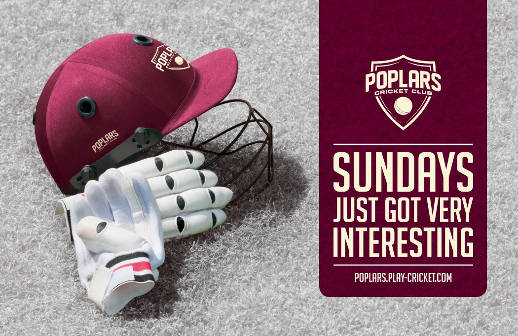
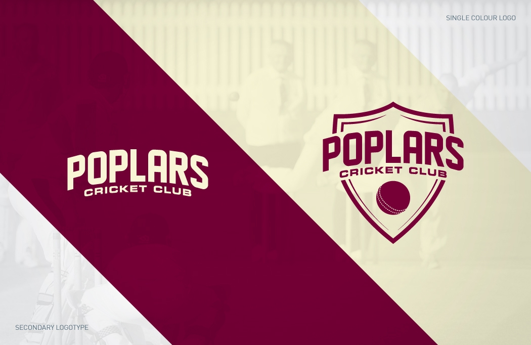
Once the whistle had blown to single end of play, we had clearly answered the brief. When they saw the winning design, they were instantly bowled over. The only restriction was to include the club’s colours of cream (for the kit) and maroon (for the badge) and we’d like to think we introduced these perfectly.

The next stage
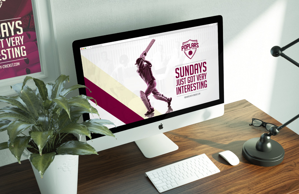
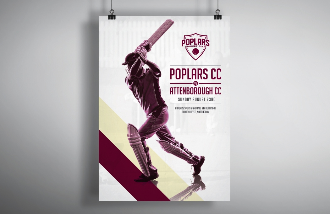
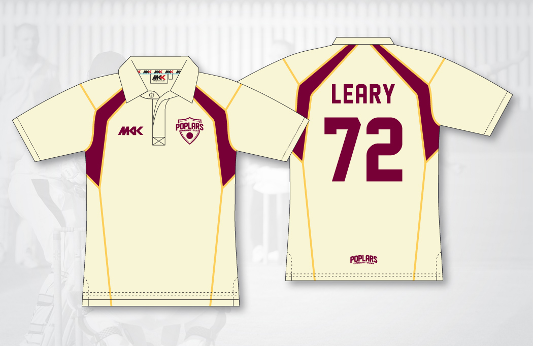
The next item on the agenda was to design the shirts, desktop background images and fixture posters. We also created a secondary ‘logotype’ that will be used as a signature on products and when less space was available. At the end of the project we had another very happy client!

Client feedback
Perfect… just the look we were aiming for, forward thinking, modern and appropriate, but still traditional enough so as not to age too quickly.
David Thompson, Owner
We’d love to do more cricket logo design and branding, so if you run a club or are responsible for marketing one, get in touch. To view more of our Design for Sport portfolio, click here.