

Prospectus Design with an ‘urban’ splash.
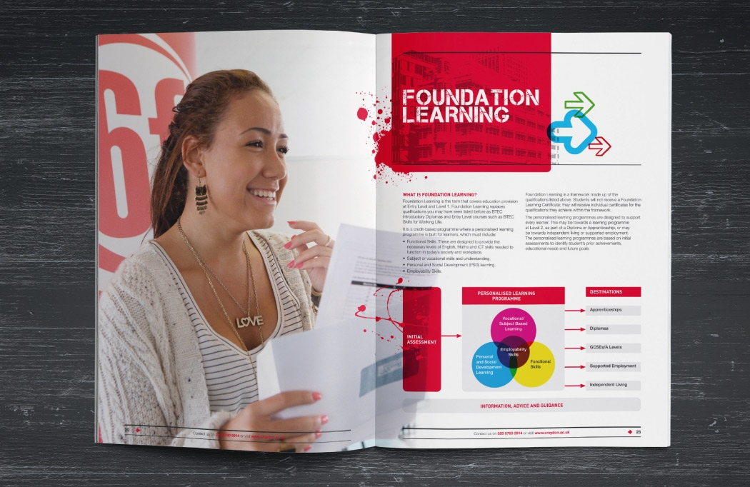
We’ve created hundreds of marketing materials for Croydon College over the years. This prospectus design is one of our favourites. The college wanted an urban look that felt youthful and energetic to appeal to students. At the same time, it needed to stay clear and concise to appeal to parents who inevitably help students choose their next step in education.
Capturing the urban vibe
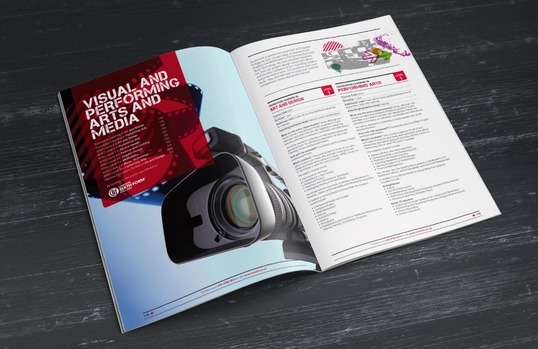
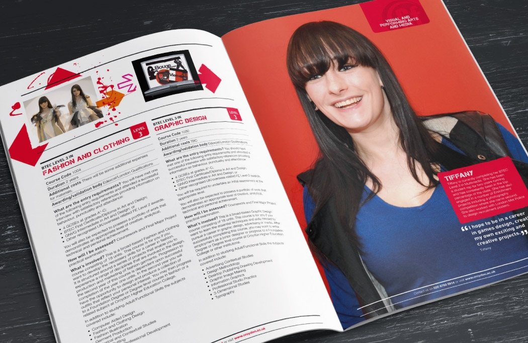
Croydon is a very urban environment, so the theme was perfect. We chose a distressed headline font called Capture It. This was paired with colourful graphics, like chevrons and paint splats, giving the prospectus a lively, youthful feel.
For the course information, we switched to a more business-like style. Each section had a full-page divider, and all right-hand pages featured a tab. This made it easy to navigate, so readers could quickly find the course or curriculum area they wanted.
Working with BLU:72 Creative by Dr. Mike Pollard
During my time at Croydon College, we collaborated closely with BLU:72 on all marketing output. They became like part of the marketing team.
When given a brief, they immediately understood our goals. Over the years, they produced countless items, including:
- College prospectus designs
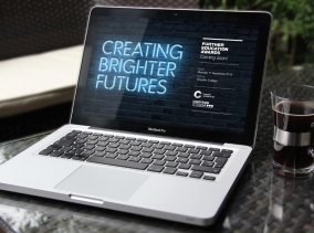
- Branding for awards ceremonies
- Designs for open events
- Enrolment and Clearing literature
- Advertising campaigns
They really understood what we wanted to achieve and delivered consistently.
Dr. Mike Pollard – Former Marketing Manager at Croydon College
Results
Croydon College continues to be one of the largest providers of further education in the south east. Our designs go some way towards getting the message across to the region that Croydon is a great destination to continue their studies.
If you are part of a marketing department that requires college prospectus design and wish to see more examples of this type of work, please feel free to get in touch.

Click here for more reviews from happy clients.