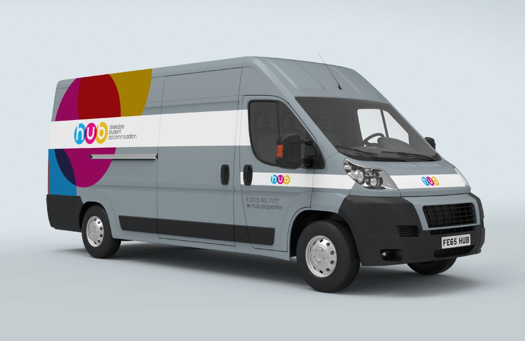


Property logo design & branding for desirable student accommodation across the East Midlands.
Hub Properties goal is to give students a better option when it comes to finding a place to live. The properties they have on their books are more aspirational than your average student let, so Hub’s Director, Geoff Spencer, felt the new identity should reflect this. Having worked on a few property logo design & branding projects in the past, we felt confident we could deliver just what he was looking for.
We created a number of options for Geoff to view and he was particularly drawn to the colourful ones. We narrowed it down to two final logos and and spent some time refining them, before we had a winner. Geoff and his team chose the one you see below because they liked it’s simplicity and felt that the colourful overlapping circles would be eye catching and distinctive.
The colour scheme and circles were followed through various other items such as stationery and social media graphics as well as vehicle wraps on their new vans.
Client feedback
I love the vans, they look amazing, they are certainly attention grabbing when I’m out on the road!
Geoff Spencer – Director

Other property related projects
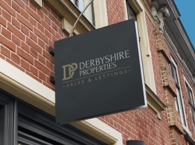
This is just one of the property logo design & branding projects we have worked on. For more, visit one of the following: Derbyshire Properties, Talk Green.
The Hub Properties website isn’t live as yet. In the meantime click here for information on student lets in the East Midlands.