When logo design goes horribly wrong
This is why you should always use a professional graphic designer!
Firstly… apologies… as some of these logos are borderline offensive… but as with a lot of things in life, they are subjective and it might depend on if you have a dirty mind or not?!? Whether the originators of each logo knew what they were doing when they designed them is up for debate. Either way, to us, they are all epic fails.
When we’re out networking or promoting our services, we often talk about how a good logo creates the right first impression, because you wouldn’t want to put off a potential customer at the first hurdle, especially if your signage is on a high street for everyone to see…

The next one can be forgiven… a little… as it’s clearly painted by someone within the organisation…
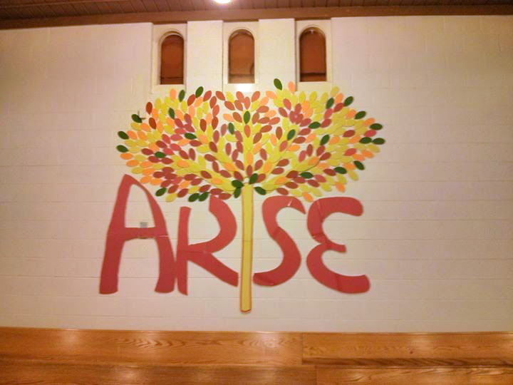
…I’m sure they set off with good intentions of using a tree to replace the ‘i’ in the word Arise. It sounds like a great idea surely? Oh dear… a classic case of when logo design goes wrong, truly making an ‘arse’ of it. It’s obviously a ‘friends-brothers-neighbour who once used Corel Draw at school’ suddenly becoming a designer.
We shouldn’t scoff, maybe they didn’t have the budget and they were just trying to do their best, but a new logo, designed professionally, doesn’t cost the earth and would have avoided these kinds of pitfalls.
This next one is a bit more unforgivable as it’s a professional job, a card for sale in a card shop, where they really ought to have paid a bit more attention to the font choice…

The saying ‘you get what you pay for’ couldn’t be more apt and it’s why we would always say ‘if it’s worth doing, it’s worth doing right’ and at BLU:72 Creative, we do it right!
To see how we’ve done it previously, click here to visit part one of our logo portfolio.
In the mean-time, here are a few more epic logo fails that don’t need any explanation…